New Parametric Data View for Component Library Folders
Contents
With the arrival of Altium Designer 15.1 and Altium Vault 2.5, the Component Library type folder receives an additional view mode - the Components View. Similar in look and functionality to other areas such as Model Links and Component Definitions in a CmpLib, or the results view when performing a search in the Vaults panel, this view allows you to browse the parametric data associated with all Component Items in the current folder. What's more, you can set up the view exactly how you like it for different folders of components, and those configurations will remain between sessions.
Access
To access this parametric data view mode, simply browse to a Component Library folder in the Vaults panel, click the  button at the top-right of the components listing, and choose the View » Components View command from the associated menu.
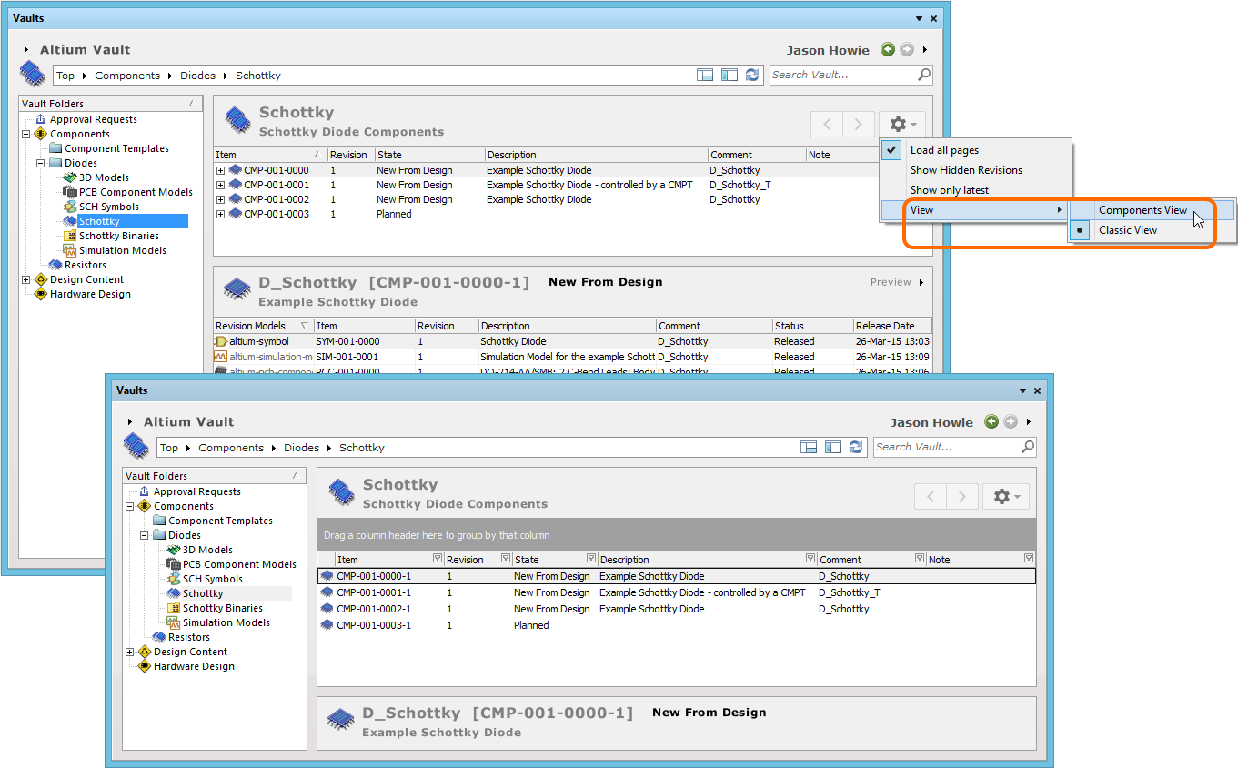
Access the Components View for a Component Library folder, presenting Component Items in terms of their parametric data.
Controlling the Display of Columns
Each column in the view corresponds to a specific parameter. Configuration of which columns are displayed - so which parametric information is presented - is performed from the Select Parameter Columns dialog. Access this dialog by right-clicking within the column headers area, and choosing the Select Columns command from the context menu that appears.
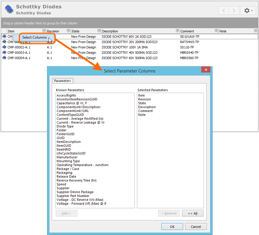
The Select Parameter Columns dialog is control central for defining which parametric data is presented in the Components View.
The left-hand side of the dialog - Known Parameters - presents all parameters associated with Component Items in the folder. From this list you can choose which parameters you would like to appear as columns in the view. Clicking the Add button will move selected parameters to the Selected Parameters region, on the right-side of the dialog. This simply lists all of the columns you want to see when viewing components.
By default, the following parameters are already in the Selected Parameters list - Item, Revision, State, Description, Comment, and Note. These correspond to the columns of data presented when viewing Component Items in a folder using the Classic View.

Additional Parameters selected, presenting as additional columns in the view.
Column Ordering and Sizing
The order of the columns is customizable. Simply click on a column's header and drag it horizontally to the required new position. Valid positions are highlighted by vertical positional arrows.
Grouping Components
Components can be grouped based on any of the visible column headings. To do this, click and hold on a column header, then drag and drop it onto the text that says Drag a column header here to group by that column.
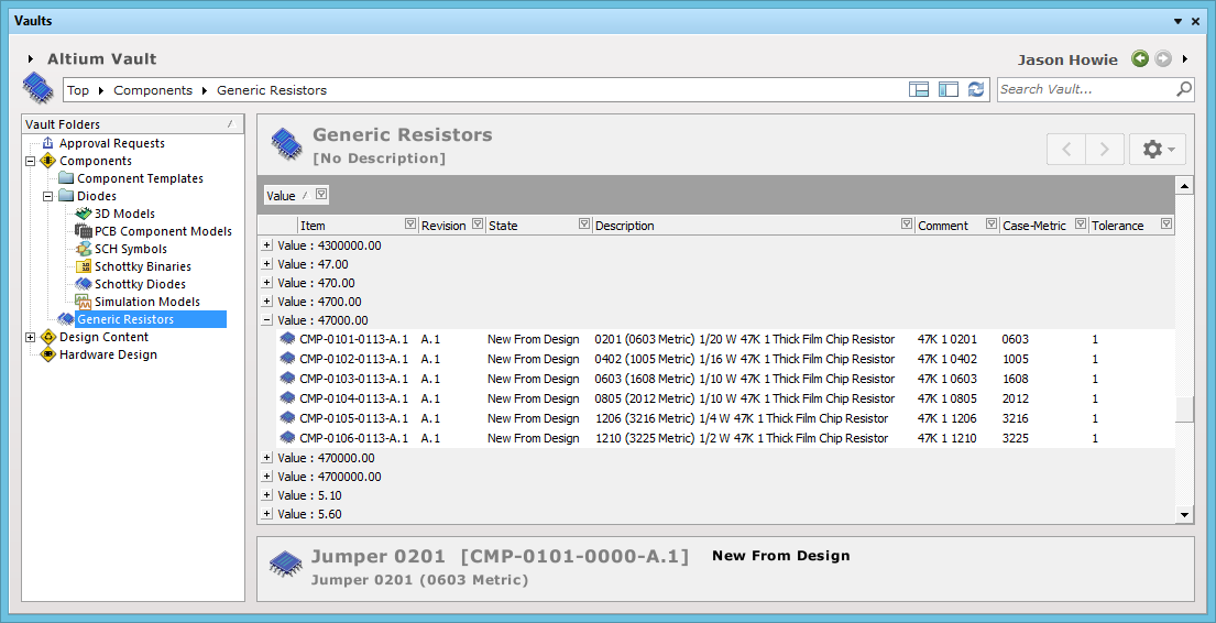
An example of customized grouping (by the Value parameter).
Sorting
Parameters can be sorted by a specific column simply by clicking on that column's header. Click once to sort in ascending order (based on the content of that column). Click again to sort in descending order.
You can sort by multiple columns. With the parameters already sorted by a specific column, simply Shift+click on another column to 'sub-sort' by the content of that column.
Column-based Filtering
Like an Excel spreadsheet, the parameters can be further filtered by the contents of each column. To do this, click the small funnel (filter) icon, located at the right-hand side of a column header ( ). A menu will appear containing a checkbox for each value present in that column. Enable the required checkbox(es), then click the Apply Filter control (at the bottom of the menu) to reduce the list to only include parameters with that value (those values).
Choose to apply column filtering.
When a column filter is applied, the filter icon is displayed in blue (), indicating that there is filtering applied based on that column. Filtering can be applied to multiple data columns. Each 'column filter' becomes an ANDed condition in the overall filter. A textual representation of the filtering currently in effect will be presented at the bottom of the region.
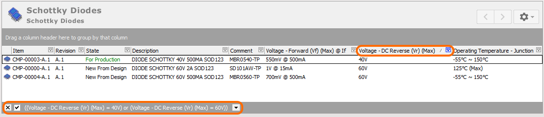
An example of column filtering in action.