Item Manager Improvements
Contents
Altium Vault 2.6, in conjunction with Altium Designer 16.0, includes enhanced functionality of the Item Manager. Improvements include: a refurbished grid that allows sorting, grouping and filtering such as the ability to control data columns, including the display of component parametric data, the ability to choose the required PCB footprint when selecting a replacement component, and ability to cross-probe from the Item Manager to component instances in the design workspace.
Item Grid
The main Item Grid has been given a beneficial refurbishment in this release with the ability to group, sort and filter content. In fact, with the same functionality in these areas as the Component Library Editor (Model Links and Component Definitions regions), you'll already be familiar with how to drive.
Grouping
Items can be grouped based on any of the visible column headings. To do this, click and hold on a column header, then drag and drop it onto the text that says Drag a column header here to group by that column.
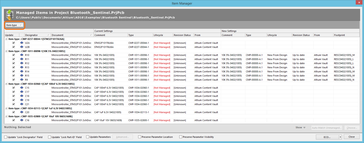
An example of grouping Items based on the values in a column - in this case by Item-type.
Sorting
As before, Items can be sorted by a specific column simply by clicking on that column's header. Click once to sort in ascending order (based on the content of that column). Click again to sort in descending order.
Column-based Filtering
Like an Excel spreadsheet, the Items can be further filtered by the contents of each column. To do this, hover the cursor over a column header and click the small funnel (filter) icon that appears at the right hand side of that header ( ). A menu will appear containing a checkbox for each value present in that column. Enable the required checkbox(es) to reduce the list to only include Items with that value.
Alternatively, for greater filtering control, select (Custom...) to display the Custom Filter dialog. Use this dialog to set up a custom filter by specifying which rows of information you want to show based on filter criteria you apply to the data column.
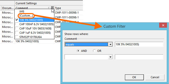
Choose to apply standard or customized column filtering.
When a column filter is applied, the filter icon is displayed in blue (), indicating that there is filtering applied based on that column. Filtering can be applied to multiple data columns. Each 'column filter' becomes an ANDed condition in the overall filter. A textual representation of the filtering currently in effect will be presented at the bottom of the region.
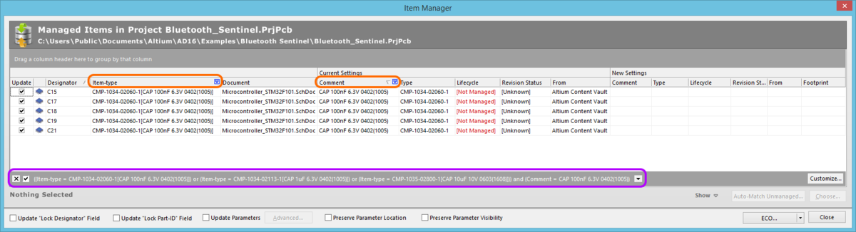
An example of column filtering in action.
To further customize the current filter, click the Customize button, to the far right of the textual representation of the filter, to open the Filter Builder dialog. Use this dialog to create more sophisticated and complex filters as needed.

Use the Filter Builder to create more sophisticated filtering.
Expand and Collapse
The Item Manager dialog's right-click menu has several commands added for quickly expanding and collapsing groupings of Items - Expand All, Expand Selected, and Collapse All.
Additional Grid Preferences
The new Preferences sub-menu - available from the Item Manager dialog's right-click menu - also contains the following additional commands and toggle options relating to the display of data in the main Item Grid:
- Best fit current column - use this command to have the currently focused column expand to fully display the data within.
- Best fit all columns - use this command to have all columns expanded to fully display the data values within. This mode is best used with the Fit table option disabled. Each column of data is sized to display all data within it, in accordance with the largest data entry and adding a little padding for good measure. Since each column is sized to display its data, the columns can collectively extend beyond the currently viewable area. In support of this, a horizontal scrollbar is provided to allow ease of reading.
- Cell auto height - use this option to adjust the height of cells automatically to fit the data, effectively wrapping data within a cell.
- Fit table - use this option to fit the grid to the available width of the dialog. In this mode, the software will attempt to display all data columns within the viewable area of the grid, stretching or condensing as needed. This mode works fine when there are not too many data columns, but legibility can suffer when a great number of columns are present.
Selecting Data Columns to Display
This improvement allows you to control the data that is presented for components within the Item Manager by effectively selecting the columns to display. In addition, all parametric data sourced from the existing components in the design is available, giving you all the information you need at your fingertips when deciding on replacement components.
Data visibility is controlled through the Select Columns dialog. Access this dialog from the Item Manager's right-click context menu by choosing the Preferences » Select Columns command.
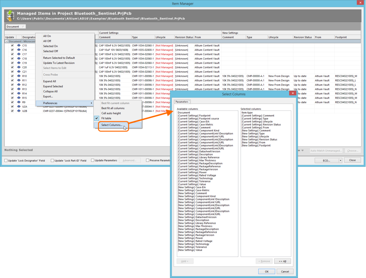
Use the Select Columns dialog to customize the data displayed in the Item Manager dialog. The columns available will vary, depending on the parametric data found in the components
within your design.
The following controls/options are available in the dialog:
- Available columns - lists all columns of data that are available to add for viewing in the Item Manager dialog. The list consists of parameters associated with the components in the design, as well as standard data (Type, Revision Status, Lifecycle, From) and also the current Footprint. From this list you can choose which columns you would like to appear as columns in the Item Manager dialog. Standard multi-selection techniques are supported when selecting the required columns (Ctrl+click, Shift+click, and click&drag).
- Add - with the required columns selected, click this button to move them over to the Selected columns list.
- Selected columns - lists all of the columns you want to see when viewing components in the Item Manager dialog. Standard multi-selection techniques are supported when selecting the required columns to remove from the list (Ctrl+click, Shift+click, and click&drag).
- Remove - with the required columns selected, click this button to move them over to the Available columns list.
- All - click this button to remove all columns from the Selected columns list, moving them back over to the Available columns list.
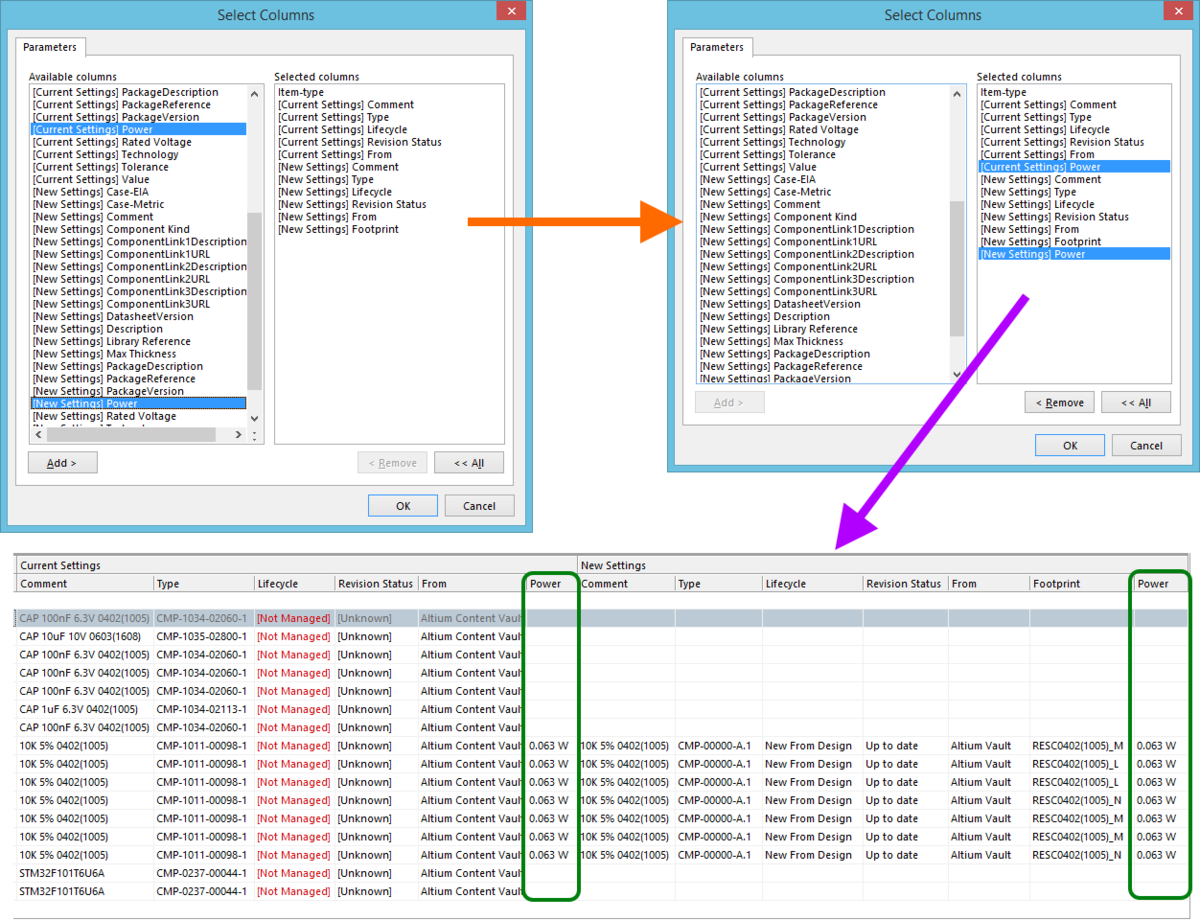
Example additional columns selected for display in the Item Manager dialog.
Defining Footprint when Choosing New Component Item
This improvement sees the user forced to manually specify the desired PCB footprint to use when a replacement Component Item has been chosen and that component references more than one PCB 2D/3D Component Model. This is handled using the Footprint column within the New Settings area of the dialog.
Therefore, while a chosen Component Item with a single footprint is handled automatically, filling that footprint's comment into the Footprint field, a Component Item with multiple PCB Component models will have its Footprint field highlighted with the entry <Not selected>. Simply click the field to access a pop-up window listing the available footprints. Each footprint is presented in terms of its Identifier (Item-Revision), Comment and Description. Click to select the required footprint, which will be entered into the Footprint field (in terms of its Comment).
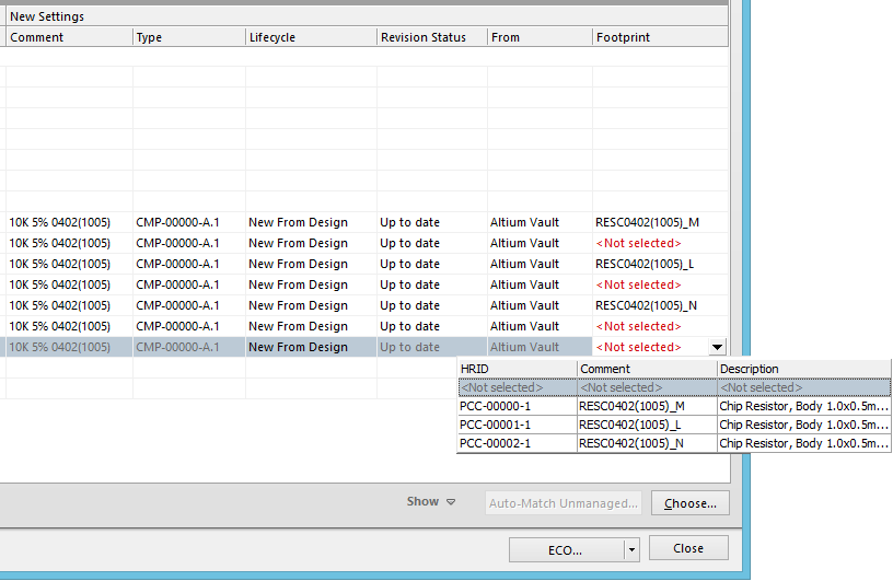
No more ambiguity over which PCB Component Item to use - you must manually specify the required model whenever your replacement
Component Item references multiple models.
Cross-Probe Functionality
Cross-probing functionality has been added to the Item Manager, which enables you to quickly probe from an entry for a component in the dialog to an instance of that component on the relevant schematic source document. Highlighting is applied to center, zoom and filter only that component in the main design window. The Cross Probe command can be found on the dialog's right-click context menu.
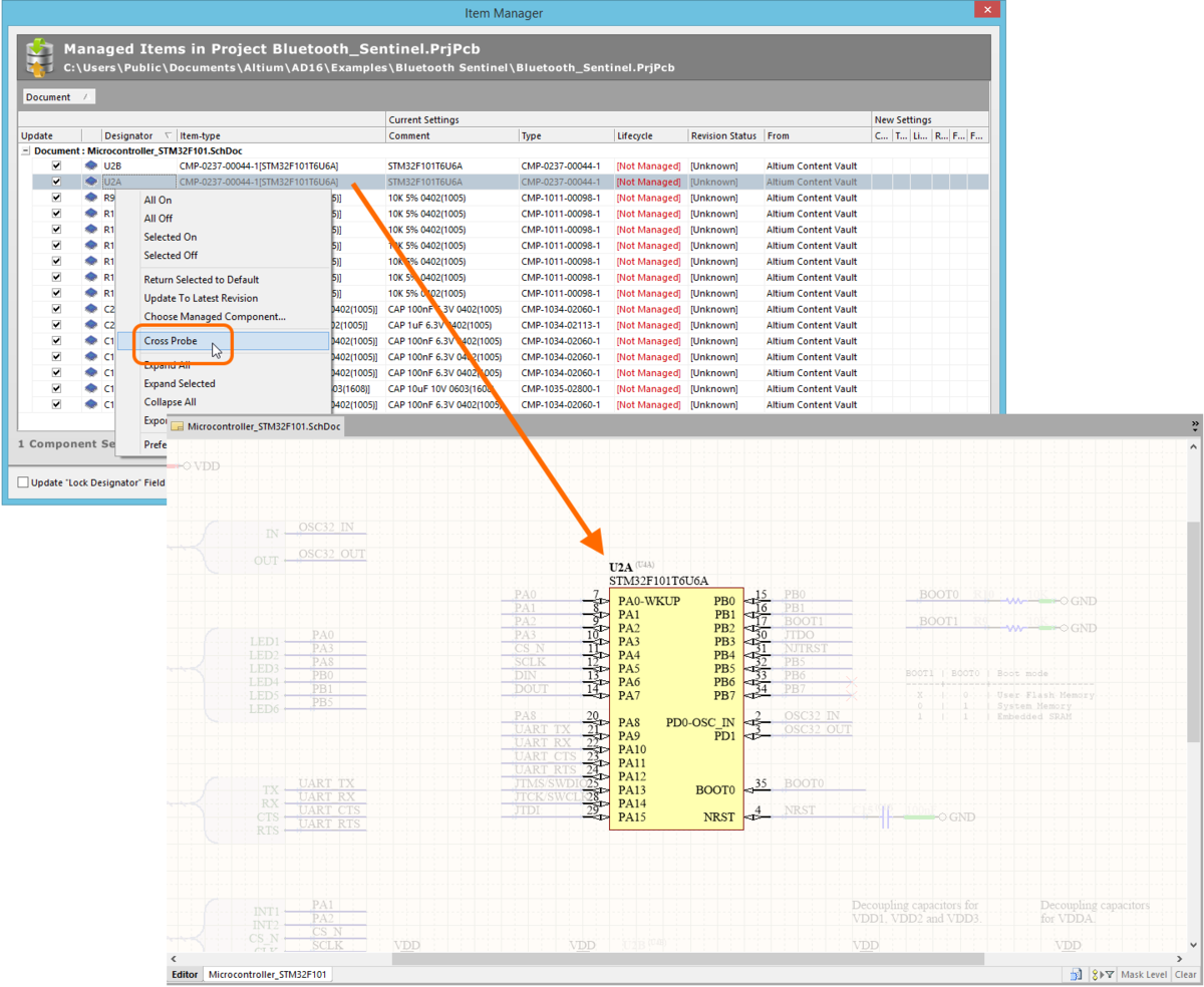
Cross-probe from the Item Manager to component instances on the source schematic documents.